


LineX White Icon Pack
4.548.00 Reviews
App Specs
- Version
- 7.9
- Updated On
- License
- $0.99
- Downloads
- 50,000+
- Developer
- JustNewDesigns
- Categories
- Personalization
- Platform
- Android
Screenshots
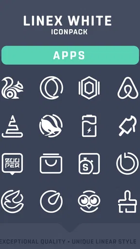

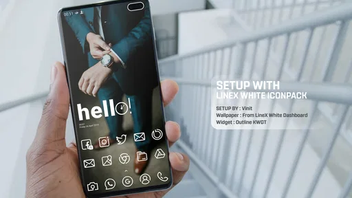
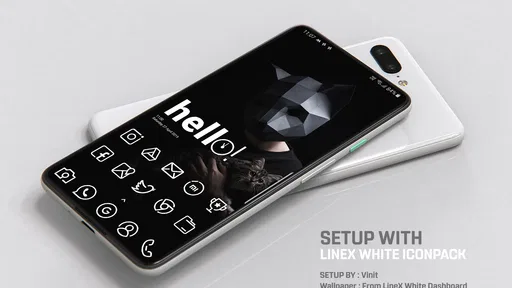
 Analysis by AppCompare
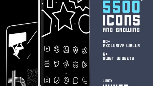
LineX White Icon Pack is the kind of personalization app I would recommend to someone who wants a cleaner home screen without replacing their launcher or redesigning the entire phone. I tested it as a focused visual change rather than a complete theme, and that distinction matters: its appeal comes from a consistent white line-art look, not from adding a large collection of extra tools. The result can make a dark wallpaper, an AMOLED-style background, or a simple monochrome setup feel much more deliberate.
Created by JustNewDesigns, this Android app sits in the personalization category and costs $0.99. It has an Everyone content rating, works from Android 6.0 onward, and is currently listed as version 7.9. The app has passed the fifty-thousand-install mark, with a 4.5 average from around seven hundred ratings. Those figures suggest a small but established audience, and my experience matches that profile: this is a specialist icon pack for people who already know they want a particular visual language.
How the white line style changes a phone
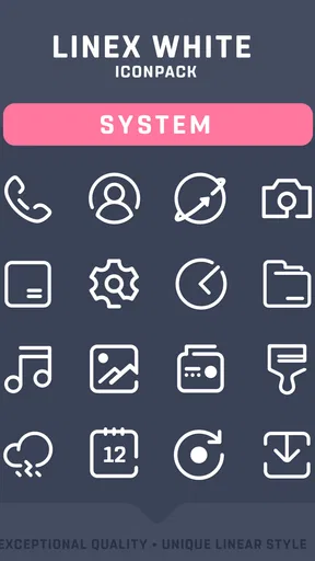
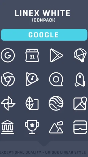
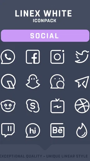
The central idea is straightforward. Instead of using filled, colorful icons, the pack presents icons as thin white outlines. That makes the home screen look lighter and less visually noisy, especially when the wallpaper is dark. I found the effect most convincing when I reduced the number of icons on each page and used the pack as part of a restrained layout rather than covering every available space with shortcuts.
The white treatment also changes how I read the screen. Color normally helps separate messaging, maps, music, shopping, and system tools at a glance. Once everything becomes white, the visual hierarchy depends more on shape, position, and familiarity. That can look excellent, but it may require a short adjustment period. If you often identify apps by color alone, a colorful icon pack may remain faster for you.
The design is especially suitable for dark wallpapers and minimal setups. On a bright or detailed background, thin white lines can lose some of their impact, and the screen may feel less coherent. I would choose the wallpaper first, then decide whether the contrast is strong enough. A nearly black background gives the icons room to breathe, while a busy photograph can make their fine outlines feel fragile.
Installation is only part of the setup
One practical point is that an icon pack depends heavily on the launcher environment. Installing the package does not automatically guarantee the same result on every Android home screen. In my workflow, I treated the pack and the launcher as two parts of one setup: install the pack, open the launcher’s icon-theme controls, apply the white set, and then inspect the pages one by one.
This is also where expectations should stay realistic. An icon pack changes supported app icons, but it does not turn every element of the phone into a matching white outline. Widgets, notification badges, folders, quick settings, and lock-screen controls may retain their own appearance. I actually prefer this partial approach because it lets me keep useful widgets, but anyone looking for a complete operating-system skin may find the result incomplete.
Worth Reading Before You Choose

EA SPORTS FC Mobile 26 Is a Bigger Football Game, but It Takes Time

Flipboard Shows What News Apps Must Do Beyond the Feed

Switching to Android Auto Means Rethinking Your Driving Routine

Google Calendar Makes a Crowded Week Easier to Manage

Ludo King Makes the Most of the Minutes Between Plans

Baby Panda World Brings Quick Play to Modern Phones, but Its Game Library Feels Busy
When an app is not represented exactly as I expect, I do not immediately assume the pack is broken. I first check whether the launcher is using an automatic substitute, whether the icon is inside a folder, and whether the app shortcut is a special variant rather than the standard application icon. That small troubleshooting habit saves time and avoids repeatedly reinstalling something that is really a launcher-side issue.
Where connectivity enters the experience
Connectivity is not the visual feature itself, but it can shape the moments around using an icon pack. The initial installation, updates, and any browsing of online store content naturally depend on the connection available to the phone. I noticed that the best time to configure a new visual setup is when I am not rushing between weak signal areas, because a delayed download or interrupted store session can make a simple customization task feel unnecessarily uncertain.
That matters more on a phone used while traveling. If I am changing the home screen before leaving home, I prefer to complete the installation and application steps in advance, while the connection is reliable. Once the icons are already applied, the everyday value is mainly visual: I can open the phone and use the layout without needing to make repeated online decisions. I would still avoid promising a particular offline behavior, because that depends on the launcher and the way Android handles the installed package.
For a data-conscious user, the sensible workflow is equally simple: download and configure the pack on a trusted connection, then avoid unnecessary repeated store visits. The listed in-app purchase range runs from $0.49 to $5.99 per item, so I would also review any optional purchase prompt carefully instead of assuming every part of the experience is included in the initial price. The main package is inexpensive, but a careful buyer should still distinguish the base purchase from optional items.
Using it in real mobile situations
My favorite use case is a phone used at night. With a dark wallpaper, low screen brightness, and a limited number of home-screen shortcuts, the white outlines feel calm without making the display look empty. I can keep the apps I reach for most often visible while allowing less important tools to stay in the app drawer. This makes the pack more than decoration: it encourages me to edit the home screen instead of treating it as a storage shelf for every installed app.
It also works well for a work phone or a personal device where I want fewer visual distractions. A colorful arrangement can invite constant scanning, while the line-based design creates a quieter first impression. That does not magically improve focus, of course, but it can support a more intentional layout. I found that placing communication apps together and keeping utilities on a second page made the white style easier to navigate than scattering icons across several screens.
A realistic example is a commute. Before leaving, I might want quick access to transit, messages, music, and maps without opening a crowded page. With a dark background and a compact row of familiar icons, the phone feels easier to check quickly. The trade-off is that I need to recognize the icon shapes. In bright outdoor light, thin white artwork may not be as immediately obvious as bold, colored symbols, so I would not choose this style solely for rapid identification.
On a tablet or a phone with a large display, spacing becomes important. Repeating thin outlines across a wide grid can look elegant when the launcher leaves enough room around each icon. If the grid is dense, the design loses some of its airy quality. I recommend adjusting icon size and grid spacing after applying the pack rather than judging it from the first default arrangement.
When the visual consistency breaks
No icon pack can guarantee that every app will look equally polished. New, niche, or less common applications are the most likely to stand out from the rest of the set. A missing match can appear as a standard colorful icon beside several white outlines, which is visually noticeable. For me, that is the main weakness of this style: the cleaner the surrounding layout, the more obvious one inconsistent icon becomes.
There are several ways to handle that without abandoning the pack. I can move an unmatched shortcut to a secondary page, place it inside a folder, or keep it in the app drawer. Another option is to simplify the first page so only the most visually consistent shortcuts remain. This is a useful trade-off: the pack rewards editing, while a broad automatic theme may be more forgiving for people who want every app represented immediately.
Launcher compatibility is another point I would check before buying. The experience is not defined only by the artwork; the launcher decides how the pack is applied, how missing icons are treated, and how much control I have over individual shortcuts. If your current launcher offers limited icon-pack support, this purchase may not deliver the polished result shown by a carefully arranged home screen. In that situation, changing launchers may create more friction than the icon pack is worth.
Recovering from a failed or incomplete setup
If the icons do not appear after installation, my first recovery step is to return to the launcher’s theme or icon settings and select the pack manually. I then check whether the launcher has separate settings for the home screen and app drawer. Some launchers can apply a theme globally, while others require an additional confirmation. These are ordinary setup differences, but they can make the app seem ineffective when the package is actually installed correctly.
If only some icons change, I look for three likely causes: the launcher may not recognize a particular shortcut, the app may use a duplicate or customized shortcut, or the icon simply may not have a matching design. I would not reset the entire phone for this problem. Applying the pack again, refreshing the launcher, or replacing the shortcut with the standard application entry is a more sensible sequence.
A useful recovery habit is to take a quick mental snapshot of the previous layout before experimenting. Icon packs are easy to change, but repeated rearranging can become annoying. I prefer to test the white style on one home-screen page first. If the contrast, spacing, and recognition feel right, I expand it to the rest of the phone. If not, I can return to the earlier arrangement without having rebuilt the whole interface.
Connectivity can complicate recovery when the installation or update is interrupted. In that case, I would wait for a stable connection, confirm that the app is installed, and then reopen the launcher settings rather than repeatedly tapping the purchase or install controls. A slow network does not necessarily mean the visual setup has failed. Separating download problems from launcher problems makes the process much easier to diagnose.
What I would check before spending money
The low upfront price makes experimentation relatively easy, but I would still consider how often I change themes. If you enjoy trying different visual styles every week, a dedicated white line pack may be a pleasant addition. If you rarely touch the home screen, a free monochrome option or the launcher’s built-in icon shapes may be enough. The value here is not the number of settings; it is whether this specific white outline aesthetic matches the way you want to use the phone.
I would also check the Android version and launcher before installing. Android 6.0 is the minimum listed system version, so older devices below that threshold are not suitable. For supported phones, the more important question is whether the launcher can apply third-party icon packs cleanly. A person using a highly customized launcher may enjoy the control, while someone using a restricted default home screen may encounter more limitations.
The Everyone rating makes the app broadly suitable from an age-classification perspective, but that does not mean it is ideal for every user. Children, older relatives, or anyone who relies strongly on color-coded recognition may find the white-only approach less intuitive. I would choose it for a user who values visual calm and is comfortable learning icons by shape, not for someone who wants maximum instant distinction between applications.
My connectivity verdict on the overall experience
LineX White Icon Pack is a focused personalization purchase rather than an all-purpose phone makeover. I like it because it gives a home screen a recognizable identity with very little visual clutter, especially when paired with a dark wallpaper and sensible spacing. The strongest results come from treating it as part of a layout decision: fewer shortcuts, consistent placement, and enough contrast for the thin artwork to remain readable.
The connection-related experience is mostly concentrated around obtaining, updating, and configuring the pack. I would handle those steps on a dependable network, then judge the app by the day-to-day appearance of the phone rather than by the store session. Users who expect a permanently connected customization service may be looking at the wrong kind of product; this is primarily a visual layer whose practical behavior also depends on Android and the chosen launcher.
The best reason to choose this pack is its disciplined white line-art look, not a promise of universal perfection. It suits dark, minimal home screens and people willing to tidy their shortcuts. It is less suitable for bright, busy layouts, heavily color-dependent navigation, or launchers that provide little support for external icon packs. Compared with a broad theme that changes wallpapers, widgets, and system colors together, this option is narrower but easier to keep under control.
After using it, I would recommend it to a friend who wants a quiet, modern home screen and is happy to spend a few minutes refining the arrangement. I would suggest skipping it if you need every app to match automatically or if you prefer colorful icons for quick recognition. At $0.99, it is a modest way to test a distinctive style, and the current version 7.9 gives the package a clear, established identity. Just approach it as a carefully designed icon layer, prepare the setup while your connection is reliable, and let the launcher’s capabilities guide your expectations.
Pros
- Clean white icons give home screens a polished
- minimalist appearance.
- Supports many popular launchers for flexible Android customization.
- Includes alternative icons for more personalization options.
- Regular updates can expand compatibility with newer apps.
- Simple design works well with dark wallpapers and dark themes.
Cons
- Some less popular apps may still display their original icons.
- Requires a compatible launcher to apply the pack properly.
- White icons can lose contrast against light or bright wallpapers.
- The minimalist style may feel too plain for colorful home screens.
- Icon requests for unsupported apps may take time to be added.
FAQs for LineX White Icon Pack
What is LineX White Icon Pack?
LineX White Icon Pack is a customization app for Android devices that replaces standard app icons with a clean, white line-style design. After installation, it can give your home screen a more consistent and minimalist appearance. The pack generally includes a large collection of themed icons, matching wallpapers, and support for popular Android launchers, although the exact number of icons and compatibility may vary by version.
Which launchers are compatible with LineX White Icon Pack?
LineX White Icon Pack is designed to work with many popular Android launchers, including widely used options such as Nova Launcher, Action Launcher, Lawnchair, Smart Launcher, and similar apps that support third-party icon packs. Compatibility can depend on the launcher version and device software. If your launcher is not supported directly, you may need to apply the icons manually or use a launcher with broader customization options.
How do I apply LineX White Icon Pack to my home screen?
After downloading LineX White Icon Pack, open the application and look for the option to apply the pack. Select your installed launcher from the available list, then confirm the change. Some launchers also let you apply an icon pack through their own settings under themes, appearance, or icons. If certain applications are not themed automatically, you can usually replace those icons individually using the launcher’s edit function.
Does LineX White Icon Pack include icons for every application?
The pack may cover thousands of popular applications, but no icon pack can guarantee an icon for every app available on Android. Less common, newly released, or region-specific applications may remain unchanged. In those cases, the launcher may use an automatic masking style, or you can request a new icon from the developer if that feature is available. Coverage can also change as updates add more supported icons.
Is LineX White Icon Pack free to use, and does it require special permissions?
The availability and pricing of LineX White Icon Pack can depend on the version listed in the store, so it is worth checking the current download page before installing. Icon packs normally do not require sensitive permissions such as access to contacts, messages, or location. However, you will need a compatible launcher to apply the icons. Review the requested permissions and in-app purchase information before completing the download.


